Paper Planes Design System
Building a configurable design system for a SAAS data intelligence platform to ensure scalability and cohesion.

The Challenge
As the principal designer, I wanted to ensure that we implemented a design system to help us move faster and better align with engineering. Building a universal system of responsive components and typography is necessary for rapid prototyping and efficient product scalability. The challenge was transforming over-built Figma files with inconsistencies and no components into a set of rules and governance for the product that can be co-owned by design and engineering.
Goals & Approach
The goal is to identify and simplify all components and variants used in the product. Reusing existing variants where applicable and eliminating single-use components improves the cost of production and allows for quick design iterations. Collaborating with the engineers from the beginning was important in streamlining the build of their storybook instance while we built the visual design system. This early alignment prepared us for an efficient, agile workflow.
Product audit
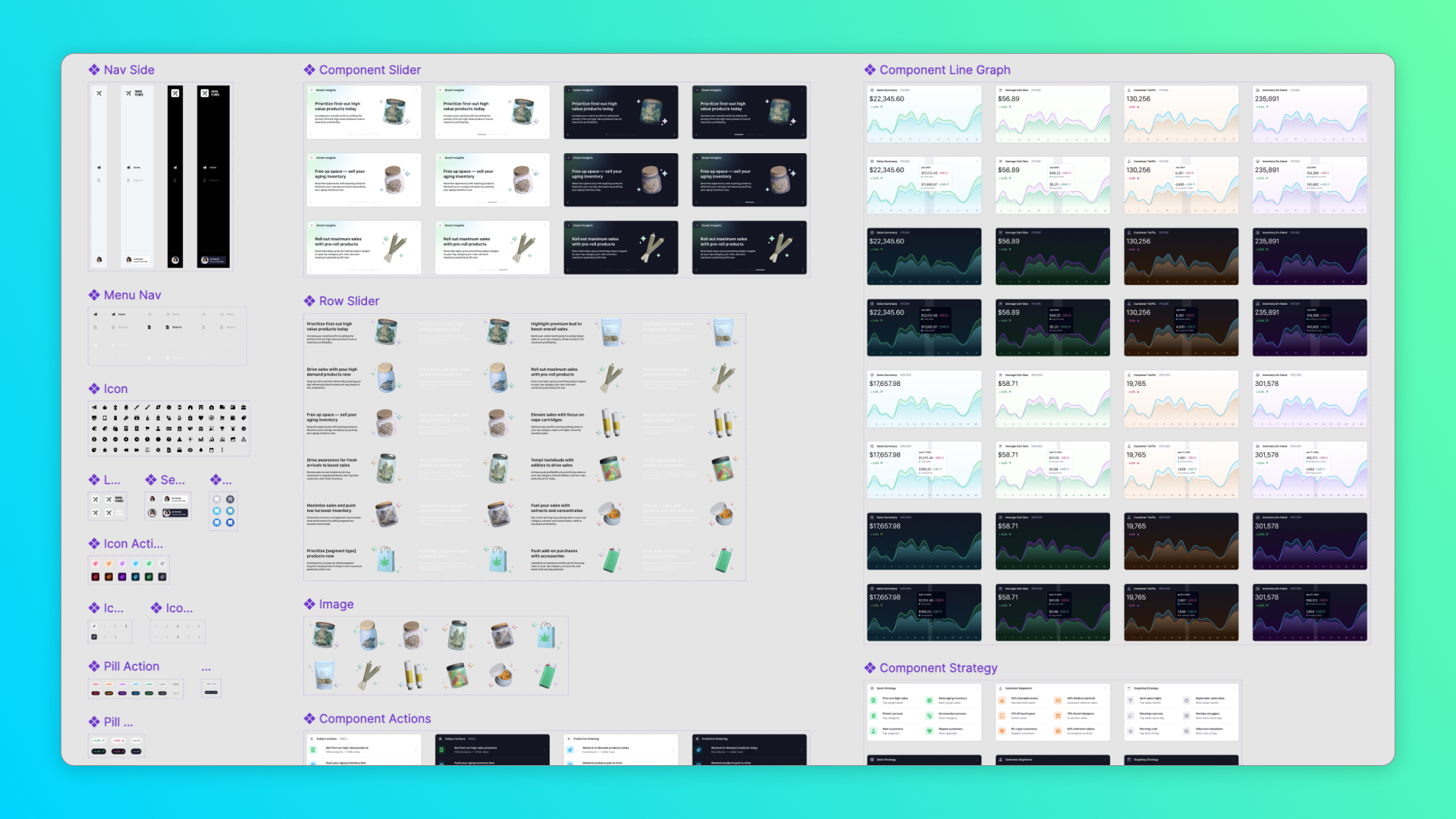
Working with the lead engineer, we cataloged a list of all the repeated components and rogue one-offs and synced on proper variant separation based on product needs. We also aligned on a naming convention for existing components early for quick referencing.
Preparation
To reconstruct the product system, we set up the dev storybook instance and the Figma file to be built and documented exactly the same to reinforce the shared vision. Both instances combined will serve as the source of truth for usage and development.
The Solution
We evolved our SAAS product with a structured design system, responsive components for all media sizes, and configurable components/variants to adapt to fast-paced development. As I led the system design and collaborated with the engineering team, we successfully built detailed documentation on component structure, variant usage, accessibility guides, and a complete storybook instance.

Universal components
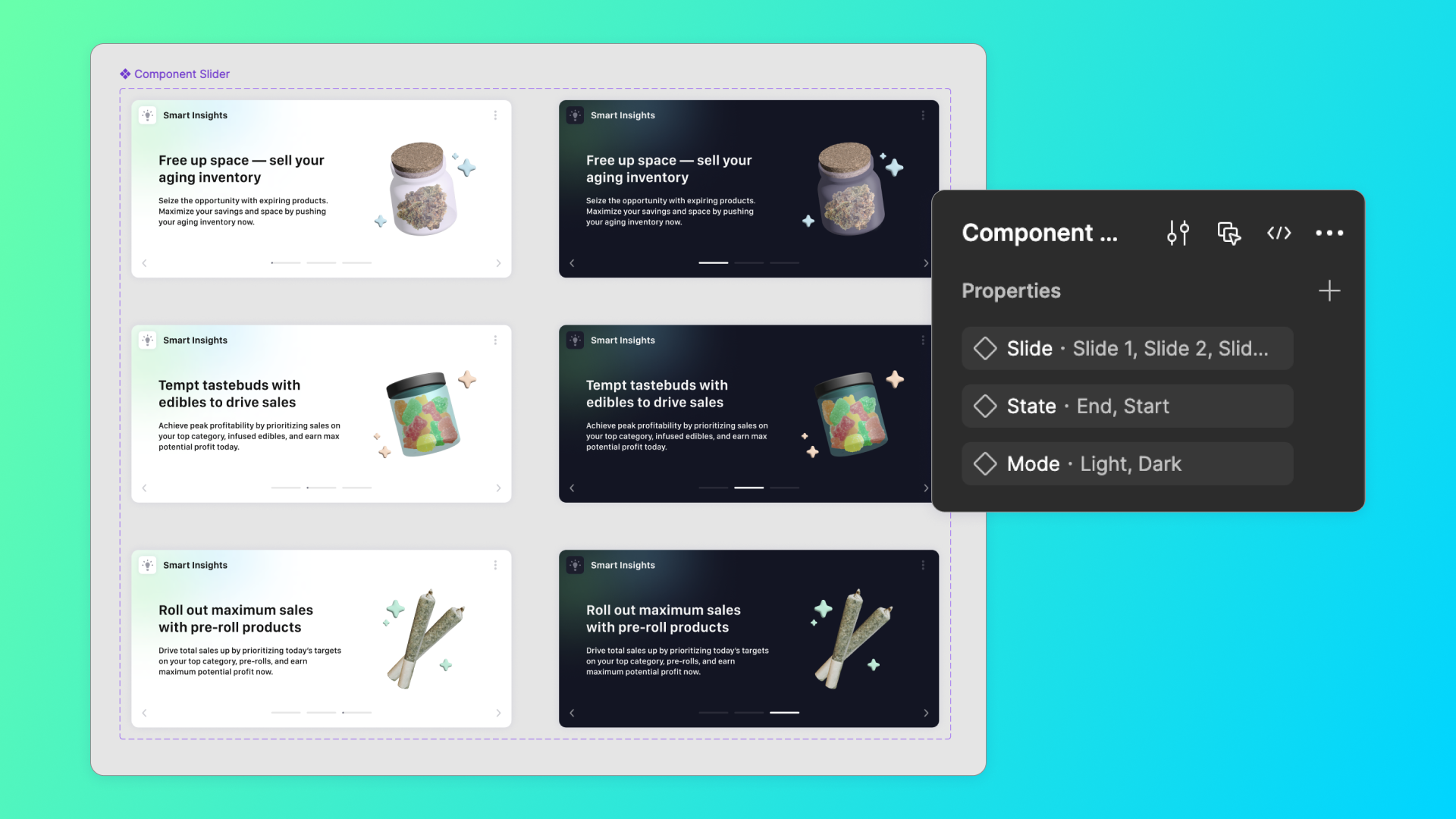
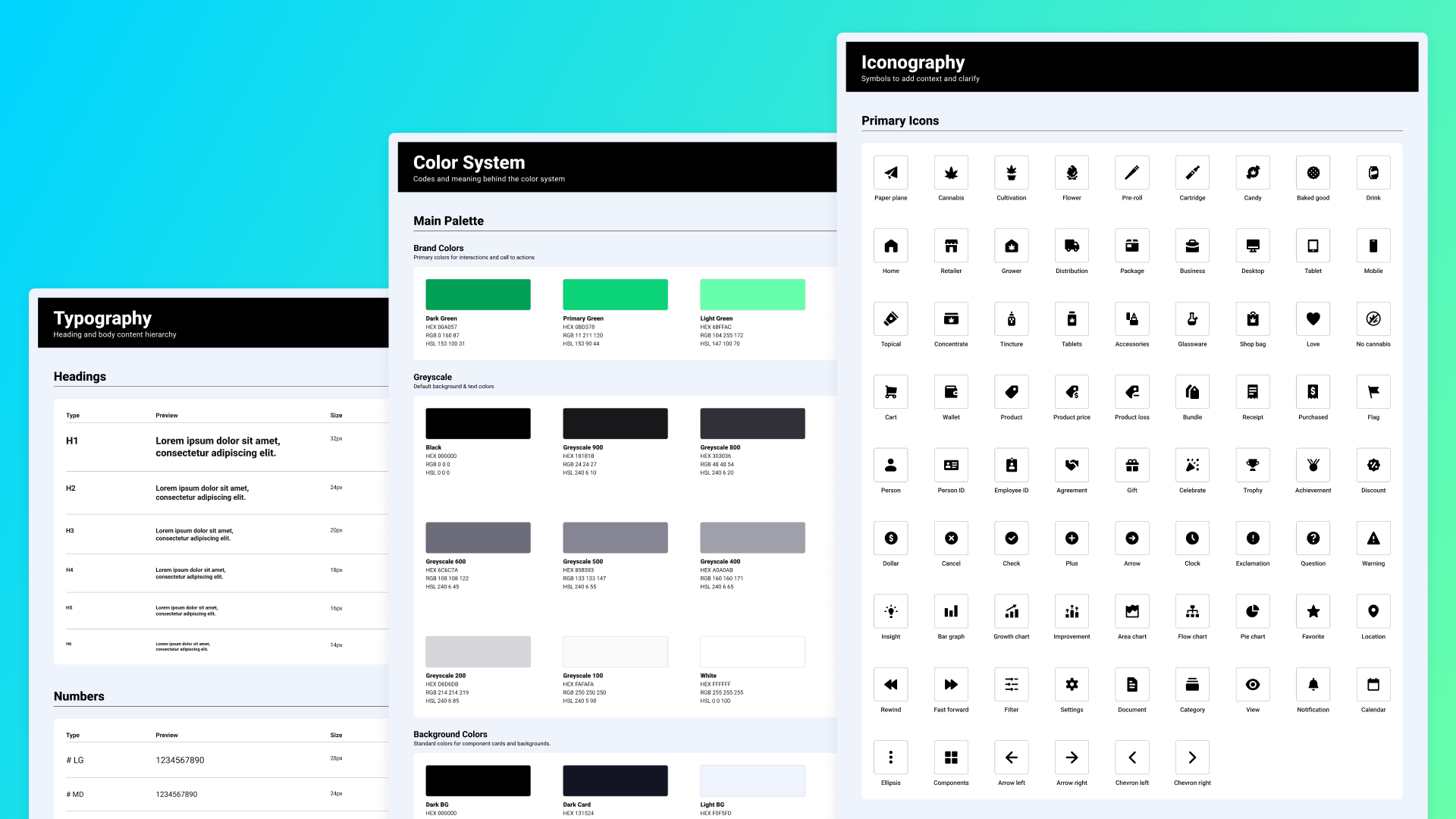
I built components, subcomponents, variants, and a typography system that are easily configurable while maintaining a consistent structure. They are designed to be automatically responsive for all desktop and mobile sizes.

Clear documentation
I also wrote a detailed guide listing all the product components, how to use the configuration system, how to translate components to code, and how to build off the foundational design system.

Accessibility standards
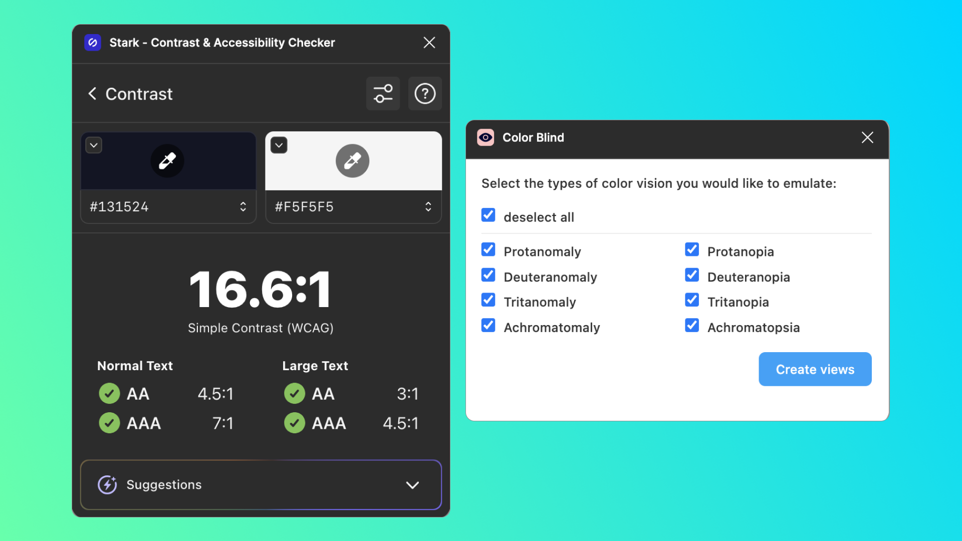
It was essential to implement accessibility standards to ensure inclusivity and compliance. They enhance the overall experience while improving readability, navigation, and usability for all users, not just those with disabilities.

Shared ownership
When completing the design system, the engineering and design team ensured all components were represented the same in the Figma file, storybook instance, and associated documentation.
Results & Impact
With our detailed design system complete, we immediately saw increased product cohesion, decreased one-off components, and a faster-paced iterative design process. By establishing documentation and clear governance for how to build and evolve variants, we quickly improved the production work and eliminated conflict between the design and engineering teams. The documentation and visibility will ensure easy scalability as new designers and engineers contribute to the product.
Conclusion
I have worked with multiple teams to build, adopt, or improve product design systems, which increased quality, alignment, and rapid development, so I wanted to set up Paper Planes for the same results. The main thing I have learned is that the success of design systems relies less on naming conventions and organized libraries but more on how to use components, evolve them, and why it matters for overall success. The most effective design systems have a shared vision between design-engineering teams and a shared philosophy of continuous improvement.

